Choosing between a Walnut or Birch wooden wall map isn’t just about liking dark or light wood. It’s really about how that map works with your space—your floors, your furniture, and the natural light in the room. Get it right, and the map looks like it was made for that wall. Get it wrong, and even a premium piece can feel a bit out of place.

Before choosing a finish, it also helps to get the size right. Our Wooden Wall Map Sizing & Placement Guide walks you through that step-by-step.
Wooden wall maps for living rooms are a bit different, so if you’re planning to hang one above a sofa or on a feature wall, use this living room guide before you pick a finish.
| Feature | Walnut (Dark Tone) | Birch (Light Tone) |
| Overall feel | Bold, rich, grounding | Clean, bright, relaxed |
| Best wall pairing | Light neutrals (white, cream, light grey) | Darker or colored feature walls (navy, green, charcoal) |
| Room size & light | Great when you have enough light to enjoy the contrast | Excellent for smaller rooms or lower light |
| Visual impact | Stronger contrast and “depth” | Airy look that still stands out |
If you’re still getting familiar with wooden wall maps as wall art, start with our Wooden Wall Maps Explained guide to understand how size, materials, and design all work together.
When Walnut Is the Better Choice
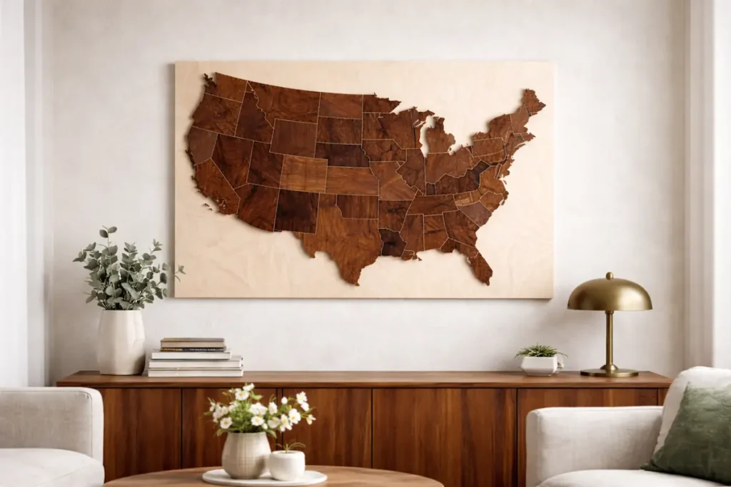
Walnut is the right call when a room feels a little flat or “cold” and needs something to anchor it. Because it’s darker, it naturally adds weight and presence to the wall. That’s why Walnut often works best when you want the map to feel like a centerpiece, not just another decoration.
If you’ve got a home office with darker furniture, leather chairs, or a living room with clean white walls, Walnut tends to look intentional and confident. Another bonus is depth—the darker tone can make the 3D layers look more dramatic as the light shifts during the day.
If Walnut feels like the right direction for your space, our Smokey Edition review walks through how darker tones and layered depth look once the map is actually on the wall.
When Birch Makes More Sense
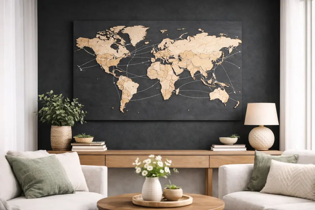
Birch is a safer and more flexible option, especially if your room already has a lot going on. Because it’s light, it doesn’t fight with other wood tones as much. Instead, it keeps the space feeling open while still looking sharp on the wall.
If you’re going for a minimalist, Scandinavian, or Japandi-style vibe, Birch usually fits right in. It also looks fantastic on dark feature walls—deep blues, greens, or charcoal—because the lighter wood pops without feeling heavy.
If Birch sounds more like your style, the Nordik Edition review shows how lighter finishes and cleaner tones work as long-term wall art.
Still unsure about size? Use our Wooden Wall Map Sizing & Placement Guide to choose the right dimensions for your wall before you buy.